Logo
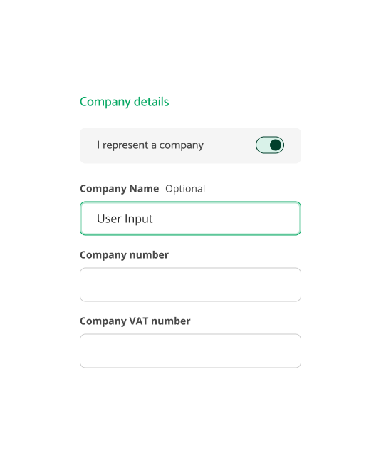
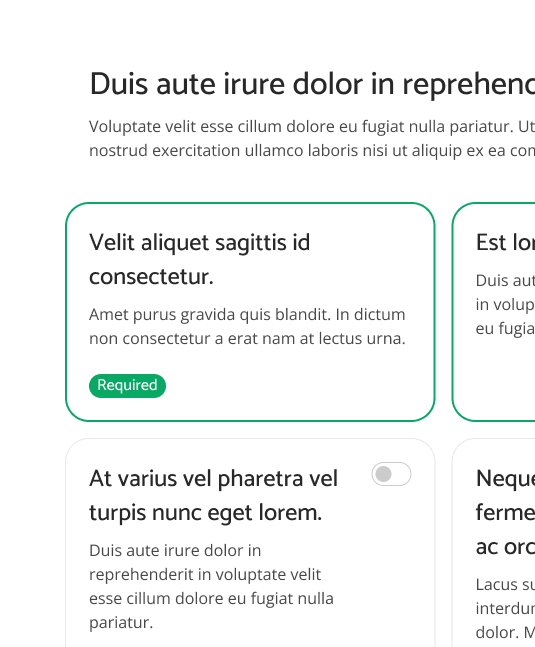
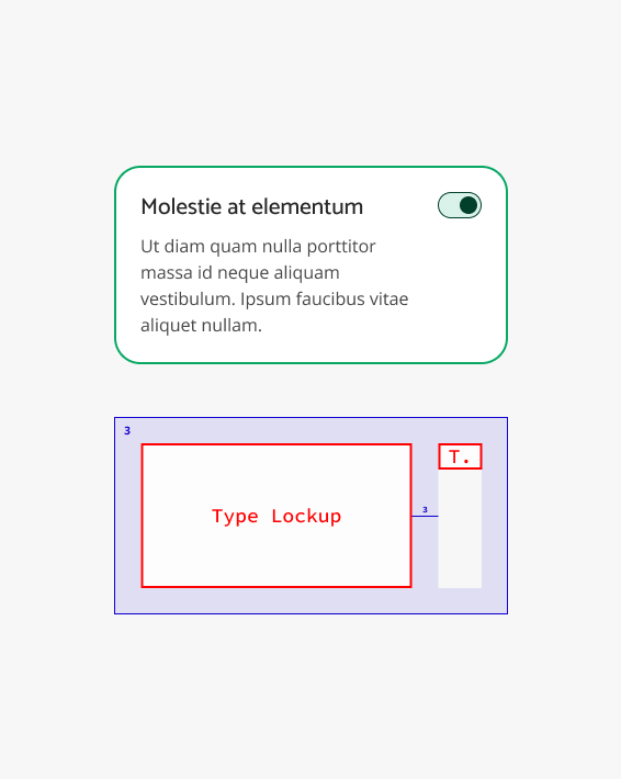
Crafting ReComm's Multi-Brand Design System.
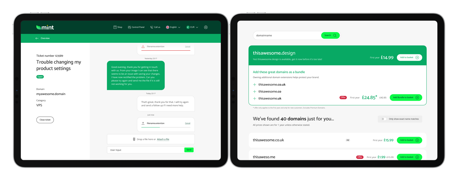
Through experimentation, innovative design solutions, and collaborative efforts, I led the creation of this system that not only streamlined the design process but also allowed for a high level of customization, enabling efficient scalability and adaptability for future challenges.
Background
ReComm emerged as a multi-brand eCommerce platform designed to tackle the challenges of managing multiple brands within GoDaddy's portfolio of brands.
To effectively address these challenges, a robust and cohesive design system was crucial. And so, the ReComm Unified Design System (UDS) was developed to streamline operations and ensure consistent user experiences across all brands.
Challenge
The goal was to develop a system that could meet each brand's unique needs, allowing them to express their unique look & feel without needing extra development effort.
Some brands, as direct competitors, wanted unique visual identities. For example, some brands preferred a friendly and soft look with lots of white space and rounded buttons. Others wanted to maximize screen space with sharper buttons and cards. Balancing these varied brand identities while keeping development efficient and fast was tough. This required a flexible but unified design strategy.
Solution
The solution was to create a variable and modular design system with brand-specific themes and business logic. This allowed each brand to maintain its unique look and feel while streamlining the development process.
The system used a key design-token architecture, enabling dramatic changes across each theme. Component APIs allowed for component-based customization. This modular approach made customization easy and implementation fast across different brands. It ensured each brand maintained its unique identity while enjoying shared efficiencies and a unified user experience standard.
My Role
April 2017 - Sep 2022
My problem-solving skills, systematic approach, and abstract thinking allowed me to create innovative design solutions. This led to a flexible and robust design system.
I led the development of all aspects of the design system, from the design-token architecture to maintaining component and pattern libraries, and creating detailed documentation. I worked closely with developers, product managers, and stakeholders to ensure seamless integration and development, meeting diverse needs and expectations.
Customizable Design Sub-Systems allowed for each brand to express their look and Feel.
Shape System
The Shape System offers four levels of roundness:
  • None;
  • Week;
  • Medium;
  • Strong.
A brand targeting a professional audience might opt for sharp, angular shapes, while a brand focusing on a less tech-savvy demographic might prefer softer, more rounded shapes.
Typography System
Each Brand can choose from 3 font-size ranges within the classic typographical scale:
  • Small - 14 to 48;
  • Medium  - 16 to 55;
  • Large - 18 to 63.
This ensures the best typographic expression, whether optimizing screen space with small text or creating bold statements with large text
Color System
ReComm's colour system is made of three colours sets:
  • Brand colours;
  • Grey tones;
  • Action colours.
The colours in these sets have a precise purpose in promoting hierarchy and emphasis. Some colours are coupled in contrast pairs to ensure readability and accessibility standards are met.
Layout System
The Layout System features a variable Grid Unit system with options for:
  • Small - 14 to 48;
  • Medium  - 16 to 55;
  • Large - 18 to 63.
Adjusting design density enables each brand to tailor the visual experience to their specific audience, whether that means a spacious design for a modern, airy feel or a denser layout for content-rich applications.
These features collectively enabled brands to create distinctive looks while adhering to a cohesive design system, balancing flexibility and uniformity. Each individual brand's settings were saved as a Theme. To create a brand-agnostic workflow we defined a default theme, Mint, used for development and testing.
A comprehensive library of components and design patterns enabled brands to build unique, user-friendly interfaces quickly and efficiently, all while adhering to the unified UX standards.
Key components
like buttons, forms, cards, and navigation elements were modular, enabling brands to mix and match elements to suit their needs without sacrificing consistency.
Design patterns
supported various layout configurations and user interactions, allowing brands to create unique user experiences while maintaining a coherent overall structure.
Documentation served as an essential resource for developers, designers, and stakeholders, providing clear and detailed guidelines on implementing and modifying the design system’s components and design patterns.
Technical Specifications
Providing the technical details necessary for stakeholders to understand and use the design system. Including code snippets, API references, and integration guidelines, ensuring that the design system is accurately and efficiently translated into functional code. This document is essential for maintaining technical consistency and quality across different implementations.
Guiding Principles
Outlining the core values and principles that shape the design system. Serving as a high-level guide for making design decisions and ensuring that all aspects of the design system align with the overarching vision and goals. These principles help maintain consistency, usability, and a cohesive user experience across all products and platforms.
By offering thorough and accessible documentation, ReComm empowered brands to leverage the full potential of the design system, ensuring a unified design standard across diverse applications.
For a better experience, view in Chrome and on Desktop.
Expect regular updates to content and user experience!
Logo
Let's connect!
Please bear with me as I update all my online presence.
The content on some of these links is also a work in progress.